Where does a banking app lose customers? 6 problems we regularly see in UX audits
Even a mature banking app can become less effective at key moments in the process, when new features, regulatory requirements, business goals, and security start competing with the user’s need to complete a task simply and efficiently. Our UX audits for the financial sector show that some problems recur regardless of a bank’s operating model, organizational scale, or product team maturity. In this article, we discuss six problems that most often weaken users’ trust in a banking app.
What should you know?
- The most common UX problems in banking apps rarely come from a single problematic screen. More often, they result from many small points of friction that build up across the user journey: from finding a feature, to understanding a message, to deciding whether to move on to the next step.
- A process may meet business, regulatory, and technical requirements and still remain unclear to the user. If it requires too much effort and interpretation, the customer may see it as risky, abandon the task, or contact the bank instead of using self-service.
- A UX audit of a banking app helps identify which elements of the journey, communication, and interface have a real impact on areas such as conversion, self-service adoption, customer service contact volume, and mobile channel effectiveness.
UX audit of a banking app — when is it worth bringing in an outside perspective?
An outside perspective delivers the most value when the app is already mature, has been developed over many years, and supports multiple processes, teams, and business goals. We most often work with banks and financial institutions that are planning major changes or have just completed them: a redesign, the rollout of new features, the expansion of self-service processes, or a sales campaign in which the app is expected to play an important role.
Projects like these are less likely to begin with explicitly stated business signals: a drop in conversion or NPS, a growing number of customer service inquiries, or weaker adoption of new features. That is understandable — in financial organizations, these topics are sensitive and can easily sound like an admission that something is wrong. In practice, however, they are among the most valuable starting points for a UX audit, because they help separate assumptions from the real barriers in the user experience.
We would recommend this type of audit to any institution whose app has grown organically over the years. Even a well-designed product can, over time, accumulate additional features, messages, and exceptions that make sense to the team but are not always clear to the user.
6 UX problems that most often come up in banking app audits
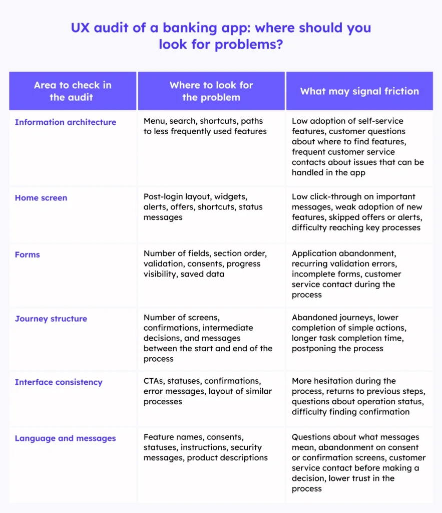
Before we move on to specific examples, it is worth organizing the types of problems that most often come up in audits. These problems can appear in many areas of an app, but they usually fall into four broader categories:
- Communication — messages, instructions, alerts, and feature naming.
- User journeys — processes that are too long, unclear, or require decisions without enough context.
- Usability — forms, information hierarchy, validation, and how the app behaves after errors.
- Information architecture — how features and content are organized in the app.
The problems described below may seem minor, especially when analyzed at the level of a single screen. Their impact only becomes visible across the full user journey: in abandoned processes, higher call center volume, lower adoption of self-service features, or more frequent moments of hesitation on the customer’s part.

1. Complex information architecture: the feature is available, but users cannot find it
One recurring problem in mature banking apps is that individual features can be hard to find. This usually results from the natural evolution of the product. At some point, the app starts to make sense mainly to the people who build and develop it. Users, however, see an extensive menu, unintuitive feature grouping, or several different places that seem to lead to similar tasks.
This is most visible with less frequent tasks: changing limits, downloading documents, managing consents, adjusting security settings, managing cards, or occasionally submitting requests for documents or data. For these actions, users do not have an established path in mind, so they have to rely on the app’s structure: section names, menu logic, and the way features are grouped. If that structure is not clear, finding the right place takes more effort than completing the task itself.
In practice, users lose their bearings, check several places, and are not sure whether a given feature exists at all or whether the action was completed in the right place. In a banking app, that kind of uncertainty quickly reduces the user’s sense of control over their money, settings, documents, and account security.
For the bank, this means lower self-service adoption, more calls to the call center, abandoned processes, and weaker adoption of features that have formally been implemented and work correctly.
This is one of those problems that can remain invisible internally for a long time but quickly surfaces during UX audits: the feature exists, but finding or understanding it requires too much effort from the user.
2. Overloaded home screen: too many messages compete for users’ attention
During audits, we often see the app’s home screen become the place where the needs of many teams converge: sales, marketing, service, security, and product. Shortcuts, widgets, promotional offers, messages, alerts, and recommendations all appear there. Each element has its own rationale, but together they create communication clutter that makes it harder to scan information quickly.
Most customers, however, open the app with a specific goal: to check their balance, review transaction history, check card status, make a transfer, or confirm an action. If they first have to separate important information from promotional, secondary, and repetitive content, the app uses up their attention before they even get to the task they came to complete.
An overloaded home screen slows access to core features and weakens the visibility of messages that truly require action. Over time, users learn to ignore elements that look like ads, another widget, or a standard post-login message.
For the bank, this creates a risk of lower conversion in key journeys. It also becomes harder to surface service information, security messages, or process status updates.
When the home screen tries to sell, inform, warn, and direct users to every feature at once, it loses its primary role: quickly putting the user on the right path.
3. Long and complex forms: users do not understand the next steps
In UX audits, we see that problems with forms become visible most quickly in sales and onboarding processes: opening an account, applying for a loan, activating a product, or updating customer data. A form may be formally correct and still be difficult to use: customers see too many fields at once, do not understand why they are being asked to provide certain information, do not know how many steps are left, or have to enter information the bank already has.
The problem is not only the length of the form. Often, what matters more is the order of fields, how information is grouped, progress visibility, consent logic, error validation, and the ability to return to previous steps.
Users stop focusing on the goal of the process and start focusing on simply “getting through” the form. In mobile apps, this effect is even stronger because, on a small screen, every additional field, unclear consent, or hard-to-fix error increases frustration more quickly.
For the bank, this means a higher risk of abandonment, applications started but not completed, and lower conversion in key sales journeys. That is why even small changes — better field grouping, saved progress, shorter sections, and the use of data already available to the bank — can have a noticeable impact on the number of completed applications.
4. Too many steps: a simple task requires too many decisions
This problem is less about forms and more about the structure of the journey itself. It appears when users want to complete a simple task, but the app takes them through too many screens, confirmations, messages, and intermediate decisions. We most often see this in tasks that, from the customer’s perspective, should be quick and predictable: making a transfer, activating a service, changing a limit, confirming data, blocking a card, changing security settings, or submitting a simple application.
Each additional step may have a valid reason: security, compliance, sales, information, consent, or confirmation. But users stop feeling like they are completing a simple action. Each new screen increases the effort required to finish the task, and when customers are trying to get something done quickly, frustration can build fast — or they may decide to leave it for later.
From the bank’s perspective, this means lower effectiveness of mobile processes, more abandoned journeys, and a greater burden on customer service. The process may meet business and security requirements and still be too complex for the task at hand.
5. Inconsistent interface: similar actions follow different rules
In a consistent app, users quickly learn how things work: where to look for information, how to approve actions, and how to recognize statuses and messages. Problems begin when the rules change between sections — similar actions look different, require different steps, or use different language. A transfer may have a different confirmation flow than a limit change, application status may be described in different language than complaint status, and similar messages may sometimes guide users to the next step and other times only inform them that an action has been completed.
This is most visible in actions that require confidence: authorization, confirming a transfer, changing a limit, blocking a card, or checking application status. When each of these processes follows different rules, users lose the smooth flow of moving through the app and have to reinterpret the interface each time: whether the process is complete, whether additional confirmation is needed, where to find confirmation of the action, and whether it is safe to leave the screen.
In banking, consistency is not just a matter of aesthetics. It affects whether users understand the consequences of an action, can anticipate the next step, and know where to look for confirmation. The less predictable the interface, the greater the cognitive effort, the more hesitation, and the higher the risk of errors.
For the bank, inconsistency increases product complexity. It becomes harder to scale shared standards, implement new features within a consistent model, and maintain a unified way of communicating with users.
6. Unclear language: users do not understand the consequences of an action
Banking apps often guide customers through decisions that have financial, legal, or security-related consequences. In these moments, interface language must not only describe the action precisely, but also help users understand what is happening on the screen and what will happen after they click.
The difficulty appears when messages, consents, statuses, feature names, or product descriptions are written from the perspective of the organization, the system, or regulation. They may be correct and clear to the team, but for customers they can feel too technical, too formal, or disconnected from the situation in which they are making a decision.
Screens related to money, security, consents, and financial obligations are especially sensitive. Users do not want to decode terminology or wonder whether they correctly understand the consequences of a click. They need clear information: what will happen, what they need to do, and whether the action is safe.
Unclear language quickly disrupts the flow of the process. Users look for explanations outside the app, postpone the decision, or abandon the action. For the bank, this means more abandoned applications, additional questions for customer service, and weaker adoption of features that were intended to work as self-service.
Summary
If you are developing a banking app that has grown alongside the organization for years, it is worth regularly checking whether its logic still remains clear to users. A UX audit helps identify areas that may seem obvious from the team’s perspective but, in practice, create uncertainty, process abandonment, or additional service costs.