
Targeted fixes, a UX audit, or a banking app redesign? What to do when conversion drops and the budget isn’t unlimited
Customers are increasingly abandoning processes in the banking app, and the number of contacts with the call center and customer service is rising. You are expected to present a plan for improvement, yet it is still unclear whether changing a few screens will be enough, a full UX audit is needed, or the problem really justifies a redesign budget. Before you involve more teams, you can start with a quick diagnosis of a selected journey. It is a simple way to organize your first observations, point to the most likely sources of the problem, and decide what the next step should be.

What should you know?
- The same drop in conversion can have several unrelated causes — the problem may lie in the screen itself, in information provided too late, or in the lack of confirmation after an action. Until you know which one is behind the real drop, it is hard to tell whether a targeted fix will be enough.
- A targeted fix, a UX audit, and a banking app redesign address different scales of the problem: a local barrier on a screen, signals scattered across several processes, or the construction of the entire solution that no longer keeps up with customer needs.
- A free UX Health Check lets you check, within 48 hours of receiving the materials, which observations justify a quick fix and which require broader verification — without access to code or customer data, and with no obligation to continue working together.
The point of abandonment does not yet tell you what to change
Analytics point to the stage where the number of completed processes drops. Data from the call center and customer service, in turn, shows what questions customers come back with for help. These signals help narrow the search area, but they do not yet determine the solution.
For example, let us assume customers drop off while adding documents to a financing application.
The problem may be on the screen
In the simplest case, the cause is exactly where conversion drops. The file-upload button is hard to see, the required document format is not specified, or the error message does not explain what needs fixing.
In such a situation, a targeted change can remove a specific barrier without rebuilding the entire journey.
The problem may have appeared earlier
A customer may only learn about the required documents after several minutes of filling in the application. They do not have them at hand and do not know whether they can save their data and return to the process later.
So they give up at the file-upload stage, even though the screen itself works correctly. What needs to change is earlier information about what to prepare before starting the application.
The problem may appear after the action
A difficulty can also appear after the action is completed. The bank does not show a clear “the document was uploaded correctly” message, so the customer does not know whether everything went through, whether they should do anything else, and when they will get a response.
From the system’s perspective, the document has been accepted and the process moves on. From the customer’s perspective, however, confirmation is missing, so the matter goes back to a consultant.
The same drop in conversion can therefore lead to three different recommendations. That is why, before even a minor change lands in the backlog, it is worth checking not only where the customer abandons the process, but also what may have stopped them on the way to their goal.
Pressure on results does not make the decision easier
When KPIs deteriorate, there is usually less time for analysis, not more. The UX team already has its own priorities, every fix needs a slot in the IT backlog, and a larger audit or redesign means additional budget and the involvement of more teams.
On top of that, the longer the search for answers takes, the more customers give up, and matters that were meant to end in the app end up with consultants.
Under this kind of pressure, it is easy to send the first plausible solution into production. Without a better understanding of the problem, though, you do not know whether the fix will affect the outcome or merely take up the teams’ time and a place on the roadmap.
The risk works the other way too. A decision to run a full audit or redesign can launch a large project before it is clear which parts of the process actually need rebuilding. The scope quickly expands to more screens, integrations, and stakeholders, even though the starting point still comes down to a general statement: customers are not completing the process.
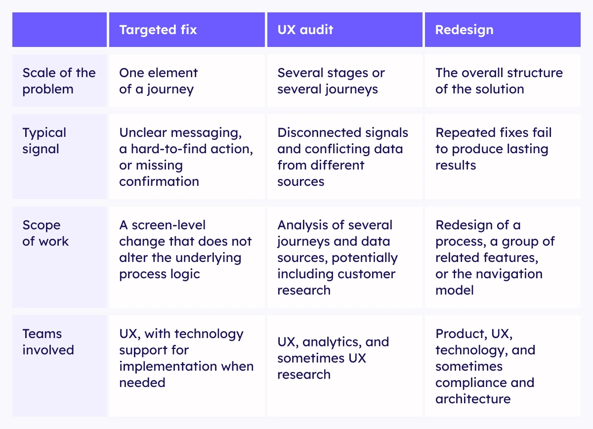
So how do you assess what scale of action is justified? The comparison below shows the difference in brief, and the details — with specific signals to recognize — are in the sections that follow.
When is a targeted fix enough?
Targeted changes make sense when the potential barrier is local and does not stem from the construction of the entire process.
It might involve, for example:
- an unclear message,
- a hard-to-see action,
- missing information about requirements,
- an incomprehensible error description,
- no confirmation that an operation was completed,
- an unclear next step.
A targeted fix is supported by a situation in which observations from the screens, analytics, and customer tickets point in a similar direction, and the change does not require interfering with the logic of the entire journey.
It is still worth treating it as a hypothesis and, after implementation, checking whether it affected conversion, the number of errors, or contacts with customer service. Even the most obvious fix should not rest solely on the team’s belief that “it looks better now.”
When do you need a fuller UX audit?
A UX audit of a banking app is worth considering when the problem cannot be reduced to a single screen or the available signals do not add up to a clear picture.
This may be the case when:
- customers drop off at several stages,
- similar problems appear across different processes,
- analytics data and service tickets point to different sources of difficulty,
- it is unclear whether the cause lies in the interface, the process logic, or the way things are communicated,
- session recordings need to be analyzed or research with customers carried out,
- the problem concerns consistency between the mobile app, online banking, and phone support,
- the team needs a broader plan of changes rather than a recommendation for a single part of the journey.
A full UX audit may cover several processes, quantitative and qualitative data, user research, information architecture, interface consistency, and dependencies between channels.
It gives a broader picture, but it also requires more involvement from the organization. That is why it helps to know in advance which questions the audit is meant to settle and which areas it should actually cover.

When is a redesign worth considering?
A redesign is justified when problems no longer stem from individual elements but from the construction of a larger part of the solution.
A signal might be a situation in which:
- successive targeted fixes do not bring a lasting effect,
- the process was built in stages and lost its consistency,
- the user has to understand the bank’s internal logic to get through the journey,
- the information architecture makes it hard to find basic functions,
- the design system no longer meets the product’s needs,
- similar barriers appear across many processes,
- the app does not support self-service, even though individual functions technically work,
- the limitations of the current solution block important business goals.
A banking app redesign does not have to mean designing the entire app from scratch. It can concern a single process, a group of related functions, or the navigation layer. The scope should follow from the problem, not from a mere conviction that the app “needs a refresh.”
A UX Health Check before deciding on scope and budget
When you need to return to the organization quickly with a more concrete recommendation, you can start with a free UX Health Check of the banking app. Our team of UX/UI designers and researchers, who have experience working on banking apps and processes, will look at the problematic process. As a result, the assessment takes into account not only the interface itself, but also the specifics of financial journeys, regulatory requirements, and the constraints of the systems in use.
Our goal is not to make a final diagnosis based on a few screens, but to point out potential points of friction, organize hypotheses, and assess which observations justify a fix and which require broader verification.
To carry out the assessment, all we need is:
- screenshots, mockups, or a short recording of the process;
- a walkthrough of the selected journey together;
- information on which stage conversion drops at;
- the most common reasons for contacting customer service;
- the business goal of the process;
- whether the problem intensified after a specific change.
We do not need code, customer data, or access to production systems. As a result, the first assessment can be produced without launching a long organizational path or involving IT just to provide an environment.
What will you receive within 48 hours?
The result will refer directly to the part of the process you share and will include:
- five potential points of friction marked on the screens,
- an explanation of how each of them may affect customer behavior,
- UX visualizations and directions for possible changes,
- three benchmarks showing other ways of solving a similar problem,
- priorities for further action,
- an indication of the observations that need confirmation in data, session recordings, or research with customers.
So the material does not end at stating that a screen is unclear or a message is too long. It shows why a given element may hinder reaching the goal and which next step is proportionate to the scale of the problem.
You can pass the recommendations on to your own team, use them as a basis for further analysis, or treat them as a starting point for defining the scope of a full UX audit.
A UX Health Check does not come with any obligation to continue working with Altkom Software.
A UX Health Check versus a full UX audit
A UX Health Check is used for a quick assessment of a single process or its problematic fragment. It helps point out likely barriers, organize first observations, and make a decision about the next step.
A full UX audit answers broader questions. It may cover several processes, data analysis, research with customers, information architecture, app consistency, and dependencies between channels. It allows the sources of problems to be verified more precisely and a detailed plan of changes to be prepared, but it also requires more time, data, and involvement.
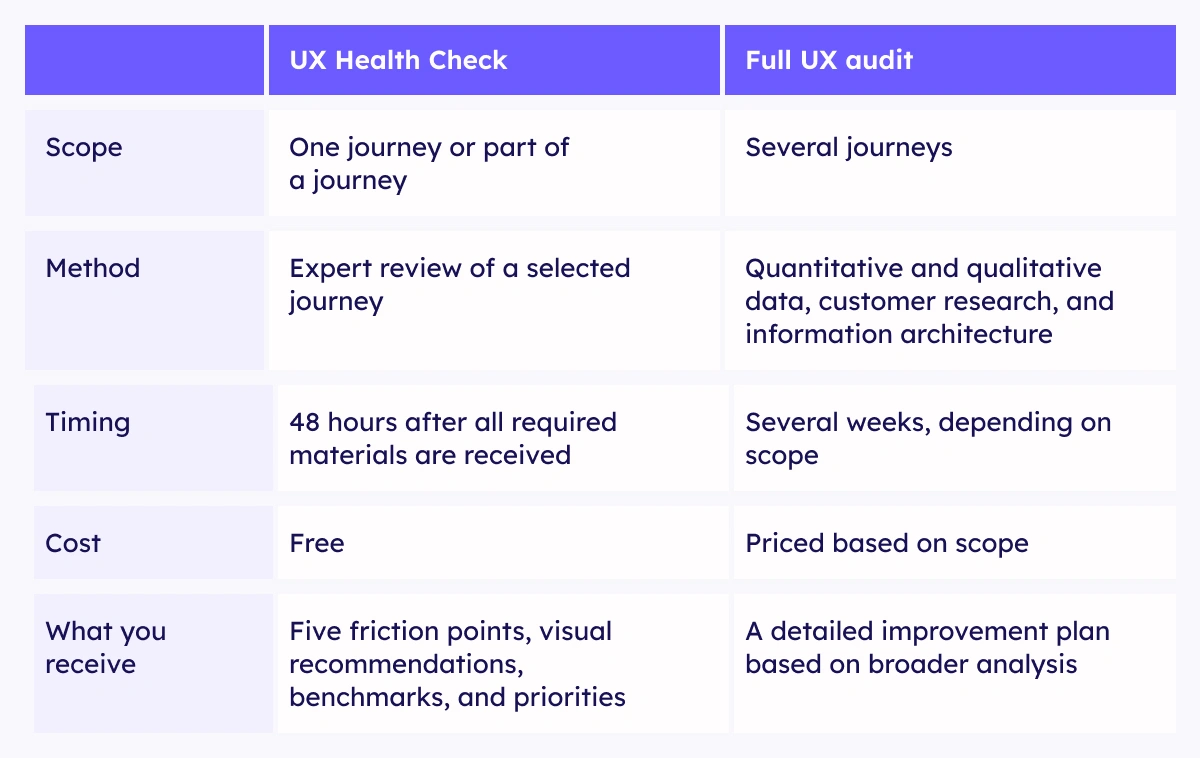
A UX Health Check is therefore not a shortened audit or a free replacement for one. It is the first step before deciding whether a full audit is needed and what its scope should be.
If the available materials suggest that the problem may stem from analytics, integrations, product rules, or the construction of a larger part of the process, the assessment should clearly indicate what cannot be confirmed on the basis of the screens alone and what needs to be checked more broadly.
Is it worth bringing in an outside perspective?
An internal team knows the product, the technological conditions, and the history of decisions that shaped the process best. When it has been working on it for months or years, however, it is harder to separate the constraints that genuinely cannot be changed from the solutions the organization has simply gotten used to.
The role of an external UX/UI team is not to judge the bank’s work or design the process anew. It is about looking at the journey without knowing its internal logic, confronting observations with customer behavior, and pointing to changes that make sense within the existing reality.
That is how we worked with one of the largest commercial banks in Poland. As part of a broader project, we analyzed selected post-sales processes in the mobile app, conducted research with users, and compared market solutions. The analysis revealed the stages at which customers lost their bearings or gave up, and the recommendations and UX/UI concepts we prepared took into account the architecture, the design system, and the way the bank’s development team works.
The bank received material for further simplifying processes and strengthening self-service, without designing the entire app from scratch.


